Place holds memory.
Claire makes layered photographs and collages about the places people live in: the barns, cabins, family stories and memories that stay put while the West changes around them.
This is the friendly rulebook for Claire’s website: how it looks, how it sounds, and how the pieces fit together. It grew out of Claire’s brand guide and a look at sixteen other artist sites (the takeaways are at the bottom). Colors, type and spacing live in the Ollie Pro global styles; the finishing touches live in one stylesheet, finish.css, in Styles > Additional CSS.
The name is the mark.
Typographic and unillustrated. No mountain silhouettes, pine trees, contour lines, antlers, badges, or faux-vintage emblems. The icon (CV) is a small stamp for favicons and verso labels and never competes with the name. Always SVG on the web.
Six SVGs, the PNG site icon, and a usage note.
Horizontal

Black on Off-white · media 3659

White on Black · media 3660
Stacked

Black on Off-white · media 3661

White on Black · media 3662
Icon

Black on Off-white · media 3658

White on Black · media 3663
Let the artwork be the color.
The interface is black, greys, white, and off-white only. No hue anywhere in the chrome, so every photograph and collage carries the only color on the page. Artwork is always shown true to color, never filtered.
White
#FFFFFF
Logos on Black and on photography.
Off-white
#F5F5F3
Page background.
Mist
#EEEEEB
Alternating sections.
Grey (rule)
#D6D6D3
Quiet dividers. Never text.
Silver
#BDBDBD
Secondary text on Black.
Slate
#6B6B6B
Reserved: dividers on dark, disabled.
Grey (text)
#555555
Secondary text. 7:1 on Off-white.
Graphite
#3A3A3A
Hover, focus, selection.
Black
#111111
Text, dark bands, footer.
Restrained old-style serif, clear utility sans.
Newsreader carries titles, exhibition text, pull quotes, and large statements. Inter carries navigation, captions, metadata, dimensions, prices, dates, and body copy. Fallbacks: Georgia and Arial or Helvetica. No script, Western slab, distressed, or typewriter faces. Both are self-hosted from the WordPress Font Library.
Display · Newsreader 400 · display
Place holds memory.
H1 · Newsreader · xx-large
The West, layered.
H2 · Newsreader · x-large
Windows into the West
H3 · Newsreader · large
Historical Works
H4 · Newsreader · medium
Divide Creek Cabin
Utility heading · Inter 500 · uppercase
Teton Valley, Idaho
Lead · Newsreader · large
Perspective is everything. Memory is layered.
Body · Inter 400 · base
Hi, I’m Claire. I make photographs and collages about the places around me: cabins, barns, old family photographs and the stories they hold onto. I grew up between Montana and the Tetons, and I keep coming back to the things that stay put while everything else changes. Have a look around, and say hello if a piece speaks to you.
Small · Grey
Thank you to the Teton Valley Museum and BYU-I for access to historical photographs.
Label · Inter 500 · uppercase · 0.14em tracking
Artist • Photographer • Writer
Metadata · title, year, medium, dimensions, availability
Dry Farms · year · medium · dimensions · availability
Fluid scale
Every size is a clamp() from a 380px to a 1600px viewport in rem units (Web Squadron formula). Nothing jumps at a breakpoint and everything scales with browser zoom.
- x-small ·
clamp(0.75rem, 0.73053rem + 0.08197vw, 0.8125rem) - small ·
clamp(0.875rem, 0.8458rem + 0.12295vw, 0.96875rem) - base ·
clamp(1rem, 0.96107rem + 0.16393vw, 1.125rem) - medium ·
clamp(1.25rem, 1.15266rem + 0.40984vw, 1.5625rem) - large ·
clamp(1.75rem, 1.47746rem + 1.14754vw, 2.625rem) - x-large ·
clamp(2.375rem, 1.71311rem + 2.78689vw, 4.5rem) - xx-large ·
clamp(3.25rem, 1.92623rem + 5.57377vw, 7.5rem) - display ·
clamp(4rem, 1.19672rem + 11.80328vw, 13rem)
Not the postcard view. The story behind it.
Claire isn’t after the pretty mountain shot. She’s interested in how a place holds onto the people who passed through it: the barn that’s still standing, the family photo in a museum box, the cabin she grew up in. Her work is at its best where those things meet.
Primary descriptors
- Artist / Photographer / Writer
- Photographic collage artist
- Place-based contemporary artist
- Artist of memory, landscape, and the changing West
Worth skipping
- “Western artist” as a generic category
- Only “local artist” (true and lovely, but there’s more to say)
- Landscape photographer
- Mountain lifestyle imagery
- Rustic nostalgia
Warm, curious, plainspoken, a little poetic.
Write the way Claire talks to a friend at an opening: real names of real places, simple sentences, a little wonder. Say enough to invite people in, then let the work do the rest.
Rooted
Use specific place names, weather, materials, real histories. Avoid generic “Western spirit” language.
Observant
Use small evidence, changes, traces, contradictions. Avoid grand claims and mythmaking.
Personal
Use first-person memory when relevant. Avoid oversharing or turning biography into the product.
Intelligent
Use clear artistic intent and historical context. Avoid academic jargon.
Neighborly
Sound like a neighbor, not a brochure. Skip luxury-brand puffery.
Quietly lyrical
Use rhythm, image, restraint. Avoid purple prose.
Words to own
place · memory · layer · trace · archive · inhabited · weathered · evidence · threshold · remnant · structure · history · perspective · disappearance · return · West
Use carefully
heritage · pioneer · authentic · iconic · timeless · rugged · wild · legacy · nostalgia
Avoid
rustic chic · cowboy spirit · wild-at-heart · mountain mama · wanderlust · Western lifestyle · elevated rustic · luxury mountain
One line, one signature, one introduction.
“Place holds memory.” is the campaign line. “Perspective is everything. Memory is layered.” is Claire’s own signature line and stays as the secondary statement. They complement one another.
Headline
Place holds memory.
Alternates
The West, layered. · What remains in a changing place. · Photographs, fragments, and the memory of place.
Signature
Perspective is everything. Memory is layered.
Introduction
Hi, I’m Claire. I make photographs and collages about the places around me: cabins, barns, old family photographs and the stories they hold onto. I grew up between Montana and the Tetons, and I keep coming back to the things that stay put while everything else changes. Have a look around, and say hello if a piece speaks to you.
One-sentence bio
Claire Vitucci is a Teton Valley-based artist, photographer, and writer whose layered photographic works examine memory, vernacular history, and the changing landscapes of the interior West.
Calls to action
View the Work · Explore the Series · Read the Story · Ask About This Piece · Say Hello
Brand filter
Before anything goes up, ask two things: does it show how Claire sees a place, and would she say it this way to a friend? If not, give it another pass.
Art-book restraint.
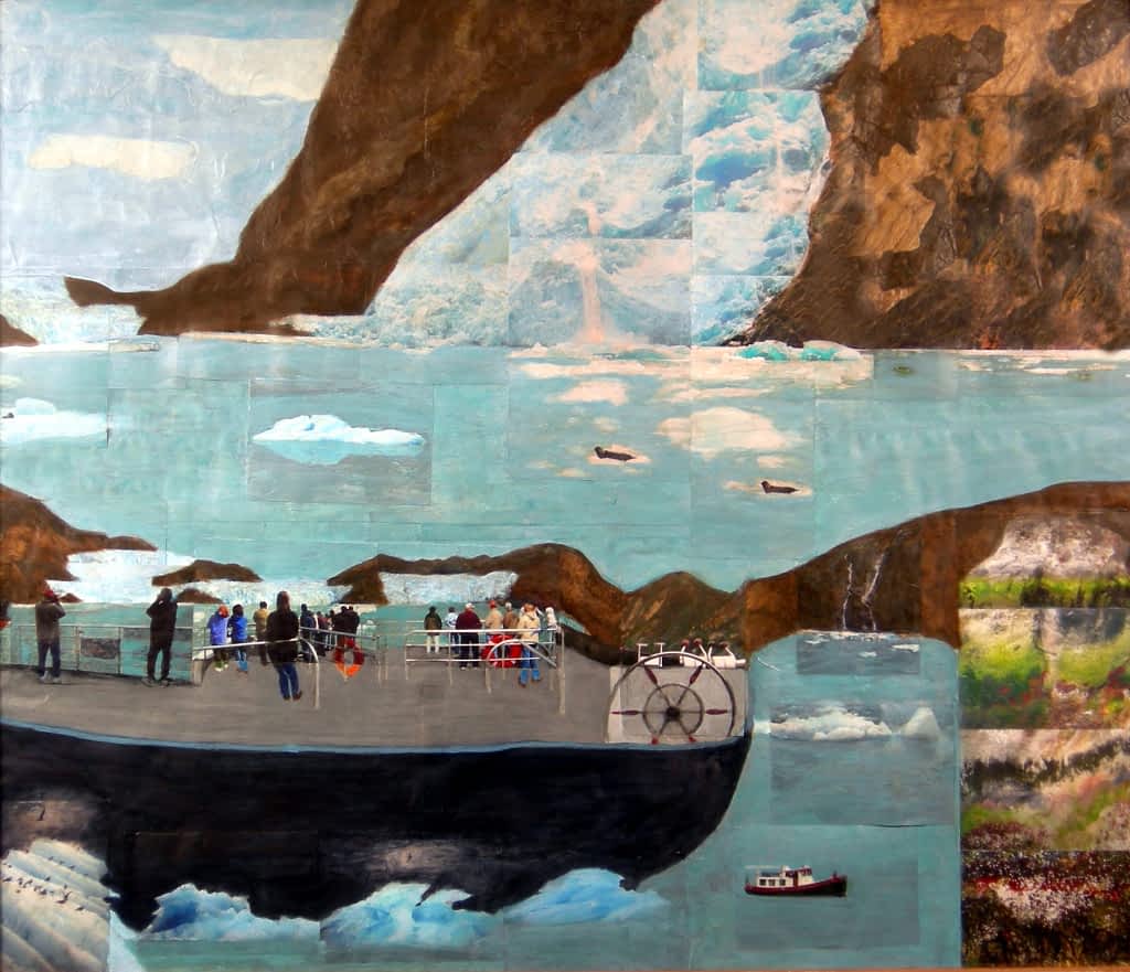
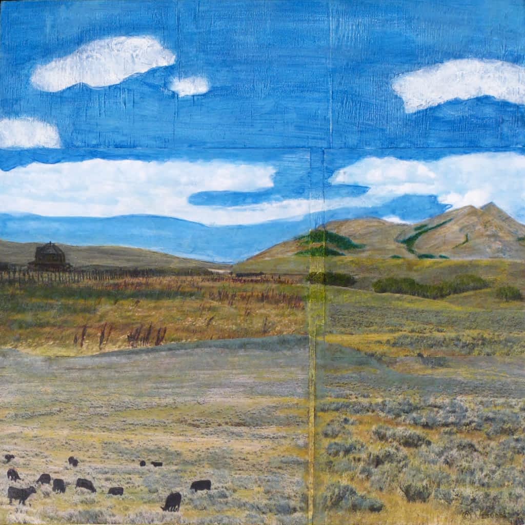
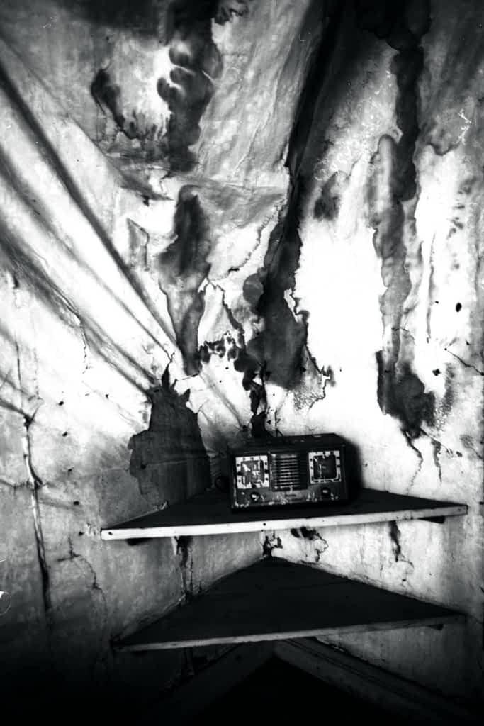
Neutral, color-accurate reproduction. No filters on finished art. One dominant image per viewport where possible, strong cropping for environment photos (never for artwork), small captions, generous margins, asymmetry and edge tension.
Metadata order
Title, year, medium, dimensions, edition or availability. The same order everywhere.
Collage pieces
Show the full work plus at least one detail crop. Include scale when practical: installation view, hand-held print, or wall context.
Archive credits
Credit historical source material clearly and consistently, for example the Teton Valley Museum and BYU-I.
Environment
Cabins, old timber, snow load, fields, airstrips, archive boxes, maps, contact sheets, the studio. Observed, not staged.
Portraits
An artist in context: studio table, archive material, a threshold between interior and landscape. No summit hero shots or staged paintbrush images.
Built from core blocks. Copy the outer block and go.
Every component is a Group, Columns, Image, Gallery, or Query block carrying a cv- class (BEM). Spacing tokens are clamp() values; radius is zero; rules are 1px Black, 3px for series headers.
On Black
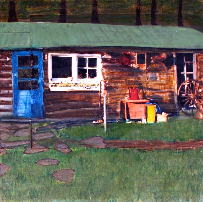
Card · .cv-card
Card title
Card: 1px Black rule, vertical label, tag, serif title, arrow link. The rule turns Graphite on hover.
Rotating tagline · Site Tagline block + .cv-rotor
Pulls its words from Settings > General > Tagline. One slow turn every 60 seconds; stops for visitors who prefer reduced motion.
Work viewer · .cv-showcase
Sticky large image that wipes to the hovered or in-view work, beside a staggered two-column grid. Used on the Portfolio, each series archive, and each exhibition. Without JavaScript it is a plain grid.
Gallery · .cv-gallery.cv-gallery–masonry
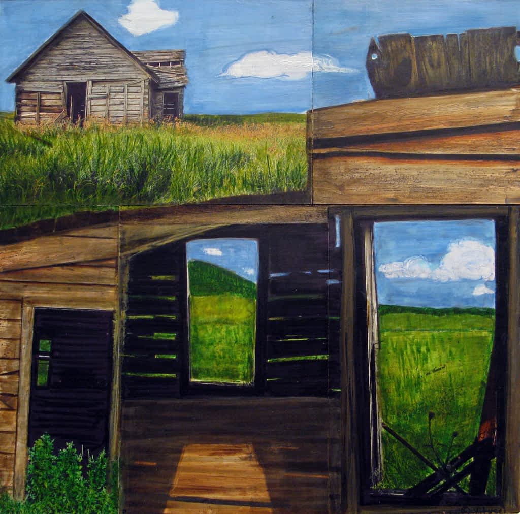
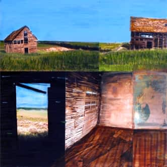
Spacing
small
clamp(0.5rem, 2.5vw, 1rem)
Inside cards, tag rows
medium
clamp(1.5rem, 4vw, 2rem)
Side padding, column gaps
large
clamp(2rem, 5vw, 3rem)
Card grids, heading to content
x-large
clamp(3rem, 7vw, 5rem)
Standard section padding
xx-large
clamp(4rem, 9vw, 7rem)
Statement and series sections
xxx-large
clamp(5rem, 12vw, 9rem)
Statement band, banner
A few house rules.
Motion is slow and optional: 60-second rotor, 70-second marquee, 900ms image wipes, all stopped for reduced motion. Focus is a 3px outline on every interactive element.
Do
- Share family stories when Claire wants to, in her own words.
- Show old buildings as records of human life and change.
- Use the Tetons when the work truly relates to them.
- Write with emotional specificity.
- Make room for loss, change, contradiction, and absence.
- Let the work travel beyond Idaho.
- Keep buying simple and friendly.
Do not
- Lean on anyone else’s name or reputation.
- Romanticize every barn as a symbol of simpler times.
- Put mountains in every brand asset.
- Use generic “soul of the West” copy.
- Promise timelessness.
- Hide that Claire is from here. Being part of the valley is a strength.
- Make it feel like a gift shop.
Files: Global Styles (theme.json overrides and Additional CSS), Code Snippets > CV Rotor and CV Showcase, logo SVGs media 3658 to 3663.
What we learned from other artists.
We looked at sixteen artist websites, from Teton Valley and Jackson neighbors to Western photographers and a few of the best artist sites anywhere. Six things stood out.
Say hello first.
The friendliest artist sites open with a person, not a portfolio. Alec Soth starts with his name and where he lives. Claire’s home page should sound like Claire.
Make buying easy and kind.
Year, medium, size and availability on every work, with an Ask about this piece button. Travis Walker and Katy Ann Fox show how little it takes.
Show the neighbors.
Not one of the seven local sites names its galleries or the artists it shows with. Radiant Remnants with Peggy Nishio, Teton Arts and Local Galleria belong on the home page.
Two sentences per series.
Binh Danh and Mark Klett show titles and nothing else. Claire’s own words about Homesteads or Historical Works are what make people stop.
Invite people to stay in touch.
Only 2 of 16 sites have a newsletter, and one is broken. A simple Studio notes signup would set Claire apart right away.
Keep what’s already working.
Claire’s site says who and where on the first screen, fits every phone, has alt text on every image and shows the art in true color. Most of the sixteen miss at least one of those.